Upselling design
Asda Newport

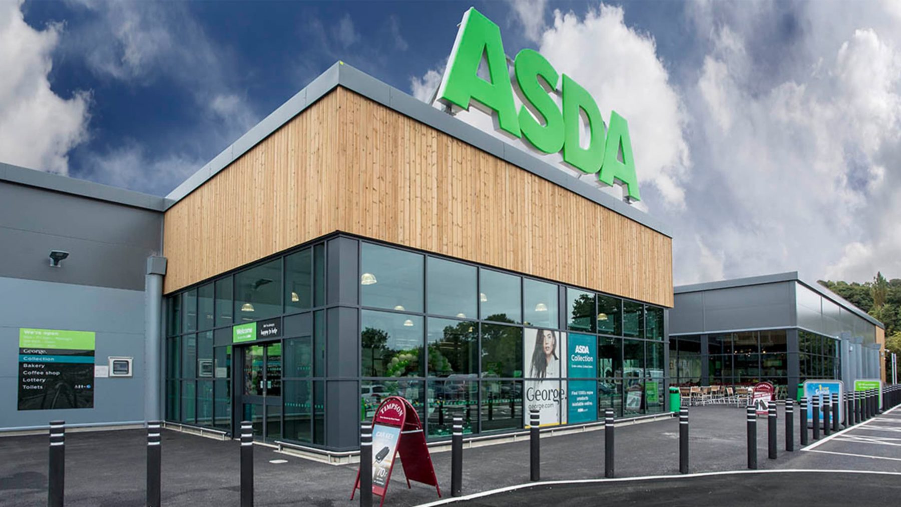
Our proposal for the Isle of Wight’s first Asda provides a bespoke design in tune with its woodland backdrop, and a landmark entrance to the vibrant Pan Meadows development.
Our experience with prominent client Asda and familiarity with their requirements enabled us to use our design expertise to turn a number of site challenges into opportunities. Our design approach cleverly uses the existing levels to our advantage by nestling the store carefully into the corner of the site. This hides less active frontages and frees up the more public facing activities of commercial exchange to play out in the foreground.
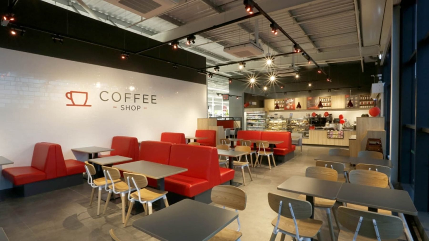
The architectural expression is a mix of opaque and glazed panels. Accents of vertical timber slats, inspired by the rural nature of the site, highlight key elements such as the entrance, checkout frontage and the corner café. This is further echoed in the low volumetric expression of the building, keeping the height down and deep-set into the topography.
To clearly demark the store entrance, a material change has been incorporated into the design. This performs both a functional role by allowing visitors to navigate with ease, but also an iconographic role by acting as a beacon which stands out against the dense green backdrop.

Vertical timber slats break up the material expression throughout, adding texture and warmth to a refined, industrial material palette.
Shop interiors

