HGP Re-Brand, The Directors’ cut
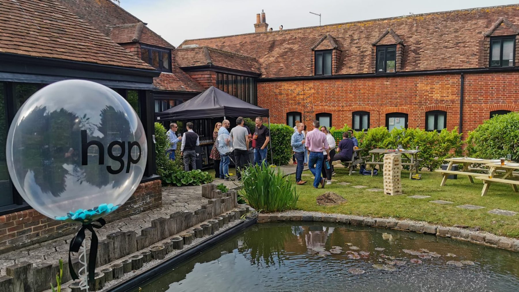
Last week we launched our new corporate identity and website. We were fortunate and thankful that the weather and government guidelines allowed for us to celebrate this milestone in our garden together as one team.
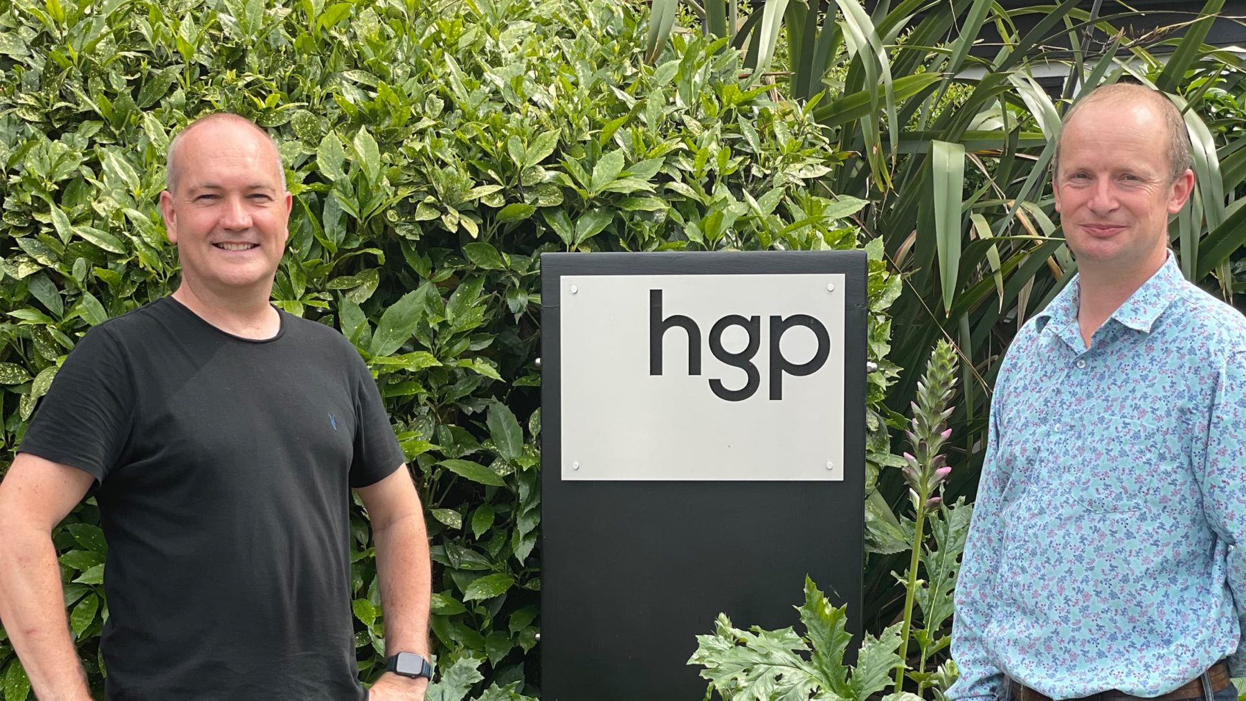
As part of presenting the new brand to all staff, the HGP brand team sat down with our directors, Chris Callard and Matthew Williams, to gain some insight into their perception of the new corporate identity.
What was the intended outcome for the re-brand?
We wanted to find an identity that felt more like us. Having been established for over 50 years, our name was not up for grabs but it felt the right time to transition the brand to reflect the current leadership and philosophy.
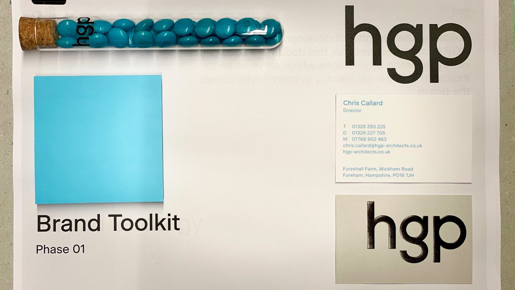
Our present logo felt inflexible and representative of a more corporate project oriented ethos. We wanted a symbol to express how we’ve evolved to be a more flexible, people based culture.
Was there any specific inspiration for the re-design?
We wanted something that represented us (HGP) as a business rather than mimic a ubiquitous architectural style. We consider that one of our key strengths that set us apart from others is the value we offer in the experience we provide for clients so we wanted any new brand or website to fully reflect this. Our belief is in the importance of understanding good principles of design and look to exemplars of that whether or not they lie within the architectural sphere.
So, we looked to other services industries that are highly influenced by good design and focused on experience such as the graphic design, art and hospitality sectors to understand how they presented themselves.
Is there a main theme conveyed by the new brand or any outcomes that change the business?
Although we perform a service attributed to many, we are unique in our approach, in our delivery and in our culture. The new brand and website doesn’t mimic others and is bespoke to us. It has shown us that we value the experience of design we provide as much as the product itself. That we should celebrate our family like culture and take more advantage of our office ‘home’.
Did HGP work with anyone to develop the new identity?
We worked with London based design company, Praline. David Tanguy and his team have done a marvellous job of taking us on a journey of self-discovery, challenging us and encouraging us to realise our ambition. As designers, we appreciated their creativity and respected their judgment, even more so when it challenged our pre-conceived notions. However, the time they gave us throughout the process and more importantly at the beginning, getting to know us, meant that the outcome was a true representation of us.
How important is the new identity to you and HGP?
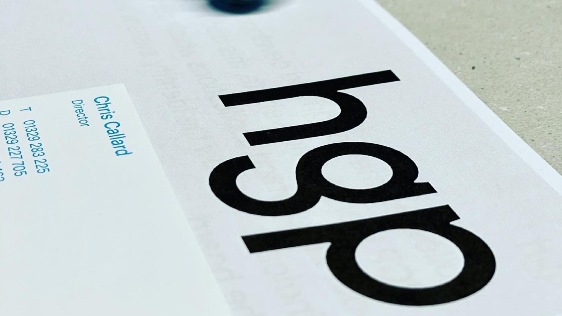
We believe in the collective. It was important to us to develop a corporate language that demonstrates the open collaborative approach we have with clients and our internal team diversity. The use of lower case letters is softer, more approachable. The bespoke font to create the logo is a conscious considered design strategy and demonstrates technical detail. The result is playful artistry reflective of a youthful HGP. We love that Praline were able to develop a logo that is truly representative of our current position but that also forms a distinct marker in our journey for future generations of HGP.
HGP has been around for 50+ years, what will this evolution hope to achieve?
HGP has a great legacy of work, an established presence on the South Coast and a strong contingency of long serving staff. These key factors stand us in good stead as a fantastic foundation. However, a company needs to keep looking forward to what the future holds as a business and within the industry so we are aiming to reinforce the legacy created and realise an ambition to further promote our creativity in designing and delivering enduring architecture.
Has there been anything learned from the process that is a key takeaway for the future as to who HGP is?
This is not a re-brand as much as a re-look at our corporate identity. Part of what we wanted from the process was to really delve into who HGP are to staff, clients, the industry currently and then address where we want to be positioned in the future. Opening ourselves up to an outside agency meant that we wouldn’t be just paying lip service to the process but we would be taken out of our comfort zone.
Praline unpicked our current identity and re-built it around core themes and principles that arrived out of our social culture and our working strategies with clients and the industry.
The process took us past our pre-conceived ideas of our identity and how that is reflected in colour and typography. We have always been completely open to new ideas and we think the result shows.
Why Now?
We had our 50th anniversary a couple of years ago which was a wonderful celebration for the company. Reaching a milestone like this naturally brings about reflection and realisation.
Navigating the business through the last year with COVID lockdowns has like many of us, caused us to consider the way in which we want to continue our practice and evolve.
The reimagining of our corporate identity is the culmination of all reflections and with the final lift on restrictions on the horizon which signifies an uplift in the human spirit and life in general, it seems fitting to launch a new lease of life for the business.
We are keen to express that it doesn’t stop here. This is a fork in the road to speak. A conscious decision to take a slightly new route. We are constantly making changes around the office, including introducing smart technology for security and low energy lighting, updating areas of the office to improve our working environment, new games for the garden and we have recently implemented Agile working which is a big reflection on how we value work/life balance.